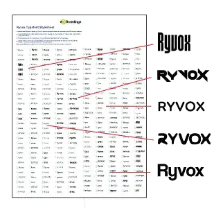
Choosing the right typography is one of the most underestimated decisions in branding. A well-structured brand typefont guide helps ensure that every visual touchpoint—from your logo to your website and marketing materials—communicates a consistent and compelling message.
While many startups prioritize naming, logos, and color palettes, typography plays an equally critical role in shaping perception. The typeface you choose influences how your audience interprets your brand’s personality, credibility, and professionalism.
If you’re still developing your brand foundation, start with a strong name using our Company Name Ideas article as a basis.
A poorly chosen font can create confusion or disconnect, while a strategic typography system strengthens recognition and trust.
Why Typography Matters in a Brand Typefont Guide
A clear and intentional typography system does more than make your brand look polished—it directly impacts usability and perception.
A strong brand typefont guide helps your business:
- Communicate your brand voice visually
- Build a cohesive and recognizable identity
- Improve readability across devices and formats
- Reinforce professionalism and trust
Typography works hand-in-hand with your broader brand assets, including naming and identity strategy. If you haven’t defined those yet, learn more about brand equity and the elements that go into it by following the link.
On the other hand, inconsistent or overly stylized fonts can reduce clarity and weaken brand authority.
How to Choose the Right Typeface for Your Brand
Selecting a typeface requires balancing aesthetics with functionality. Below are the core factors every effective brand typefont guide should address.
1. Clarity and Readability
Legibility should always come first. Your typeface must perform well across different sizes and platforms, from mobile screens to large-format displays. Avoid overly decorative fonts for primary content or logos.
2. Font Weight and Visual Impact
Font weight influences how bold or subtle your brand appears. Heavier weights communicate strength and confidence, while lighter weights suggest elegance and minimalism.
If you’re designing from scratch, pairing typography with the right brand name is critical. Find the 5 Elements of what goes into a Cool Business Name in this article.
3. Strategic Use of Italics
Italic styles can introduce emphasis, motion, or sophistication. However, overuse can reduce readability. Use italics intentionally within your typography hierarchy.
4. Letter Spacing and Kerning
Proper spacing between letters ensures visual balance and readability. Tight kerning can feel modern and compact, while wider spacing can appear more refined and premium.
Typography decisions like this should align with your broader visual identity. You can learn more about logo design and what goes into making one by following the link.
5. Case Selection (Uppercase vs. Lowercase)
- Uppercase: Strong, authoritative, and attention-grabbing
- Lowercase: Friendly, modern, and approachable
- Mixed case: Balanced and versatile
6. Serif vs. Sans Serif
This foundational decision defines much of your brand’s visual identity:
- Serif fonts convey tradition, reliability, and sophistication
- Sans serif fonts communicate modernity, clarity, and simplicity
Core Typeface Categories in a Brand Typefont Guide
To simplify the selection process, most typefaces used in branding fall into several core categories.
Sans Serif Fonts
Clean, modern, and highly legible across digital platforms. Ideal for startups, SaaS companies, and contemporary brands.
Examples: Helvetica, Arial, Open Sans
Serif Fonts
Classic and structured, serif fonts are often associated with authority and tradition. Common in finance, law, and editorial brands.
Examples: Times New Roman, Georgia, Plantagenet
Italic Styles
Italic variants add emphasis and elegance. Best used sparingly as part of a broader type system rather than as a primary font.
Examples: Perpetua Italic, Adobe Garamond Italic
Bold and Display Fonts
Designed to stand out, these fonts are ideal for headlines, logos, and branding moments that require strong visual impact.
Examples: Impact, Bebas Neue, Kartika Bold
Formal, Casual, and Specialty Fonts
These fonts help express specific tones or niche identities:
- Formal fonts: Trajan, Baskerville
- Casual fonts: Pacifico
- Specialty fonts: Handwritten or thematic styles
Use these carefully—especially in logos—to avoid limiting long-term brand flexibility.
Building a Cohesive Typography System
A professional brand typefont guide doesn’t rely on a single font. Instead, it defines a typography system that includes:
- A primary brand typeface
- Secondary/supporting fonts
- Defined font weights and styles
- Hierarchy for headings, subheadings, and body text
- Consistent spacing and alignment rules
If you’re building a full brand system, you may also want to explore naming availability and domains in the following article. 25 Ideas & Insights to Help You Choose the Right Business Name
Final Thoughts: Typography Shapes Brand Perception
Typography is not just a design detail—it’s a strategic asset. The right typeface strengthens your brand identity, improves user experience, and reinforces your positioning in the market.
A thoughtful brand typefont guide ensures your brand communicates clearly, consistently, and professionally at every touchpoint.
Need Help Defining Your Brand Typography?
Choosing the right typeface is part art, part strategy. If you want to avoid costly missteps, working with experienced branding professionals can accelerate the process and ensure long-term consistency.
A brand typefont guide defines the typography system for a brand, including primary and secondary fonts, font weights, spacing, and usage rules to ensure consistency across all visual assets.
Typography shapes how audiences perceive a brand. It influences readability, tone, professionalism, and overall brand recognition across digital and print platforms.
Choose a font based on readability, brand personality, industry expectations, and versatility. A good typeface should work across multiple sizes and formats while aligning with your brand’s tone.
Serif fonts have small decorative strokes at the ends of letters and are often seen as traditional and professional. Sans serif fonts are cleaner and more modern, making them popular for digital use.
Yes, most brands use a combination of primary and secondary fonts. The key is to maintain consistency and define clear rules for how each font is used within your typography system.”