Selecting the right font for your brand is one of the most overlooked—but incredibly important—steps in building a strong visual identity. While startups often focus on names, logos, and colors, the typeface (also called a typefont or typestyle) plays a huge role in how your audience perceives your business.
Your brand’s font must align with your overall strategy and style. The typography used on your logo, website, and marketing materials should work in harmony with your visuals and tone of voice. Choosing the wrong typeface can send mixed messages to your audience and dilute your brand’s impact.
Why Typeface Matters for Your Brand
The right font:
- Supports your brand message
- Creates a cohesive visual identity
- Enhances readability
- Reinforces trust and professionalism
In contrast, an inconsistent or hard-to-read font can confuse customers and weaken your brand image.
How to Choose the Right Typeface for Your Startup
When selecting a typeface, consider the following font characteristics:
1. Clarity and Readability
Your font should be easy to read in both large and small sizes. Avoid fonts that are overly decorative or complex, especially for logos or body text.
2. Font Weight and Boldness
Choose how heavy or bold you want your typeface to be. A bold font might project strength or confidence, while a lighter font can feel more elegant or minimal.
3. Use of Italics
Italic fonts can add emphasis or suggest motion and creativity. Use sparingly and purposefully.
4. Letter Height and Spacing (Kerning)
Kerning refers to the space between letters. Proper kerning ensures your text is legible and well-balanced. The height of letters also impacts how formal or playful your brand appears.
5. Uppercase, Lowercase, or Mixed Case
All caps can create a strong, commanding presence. Lowercase is often friendlier and more casual. A mix of both may balance authority with approachability.
6. Serif vs. Sans Serif Fonts
- Serif fonts have small strokes at the ends of letters. They’re often seen as traditional, elegant, and easier to read in print.
- Sans serif fonts are clean and modern, making them popular for digital use and tech-focused brands.
Main Typeface Categories for Branding
To simplify your font selection process, we’ve grouped popular brand fonts into five categories:
1. Sans Serif Fonts
Modern, clean, and easy to read. Ideal for digital-first brands and startups looking for a contemporary edge.
Example: Helvetica, Arial, Open Sans

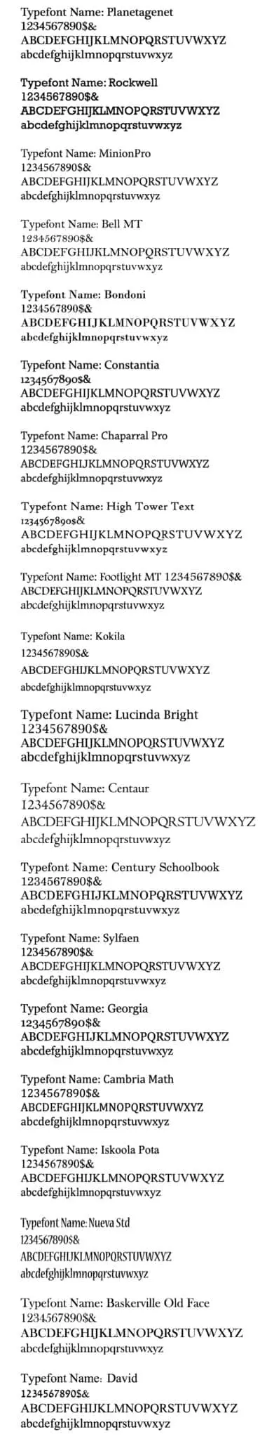
2. Serif Fonts
Classic, authoritative, and great for brands that want to communicate professionalism and tradition.
Example: Times New Roman, Georgia, Planetagenet
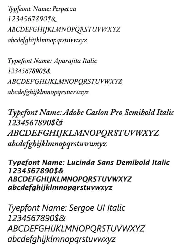
3. Italic Fonts
Stylized and elegant. Best used for emphasis or creative industries.
Example: Perpetua Italic, Adobe Garamond Italic
4. Bold Fonts
Eye-catching and confident. Excellent for brands that want to make a strong impression.
Example: Kartika Bold, Impact, Bebas Neue

5. Formal, Casual & Specialty Fonts
Fonts in this category help express tone—whether fun and quirky, elegant and luxurious, or niche-specific.
Examples:
- Formal: Trajan, Baskerville
- Casual: Comic Sans (use with caution), Pacifico
- Specialty: Handwritten or themed fonts for unique branding needs

Final Thoughts: Typography Can Make or Break Your Brand
When building a brand, every visual choice matters. Don’t let font selection be an afterthought. A serious, corporate brand shouldn’t use a whimsical script font—and a fun, creative brand should avoid overly stiff or formal typography.
With our branding font guide, you’ll have the insight to choose a typeface that reflects your company’s personality and values—clearly and consistently.
Need Help Choosing the Perfect Font?
Our design team can help you select the ideal font for your logo, website, and marketing materials. Just share your brand goals, and we’ll guide you through the process.